Designing e-commerce websites is probably one of the most complicated task for a web designer. Your client (or yourself) will have some very clear goals that will make the UI even more important, you will also need to take special care of your visitors.
1. Keep it simple
No matter what kind of products you are selling, make it easy to by products on your ecommerce site. Have images for products or categories on the homepage, use a clear hierarchy for a consistent navigation. Never put more information than the user needs, it just annoy them.
2. Have quality pictures of your products
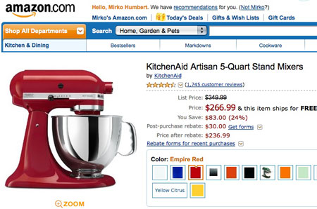
You want to sell your products right? Then have decent pictures, otherwise nobody will want to buy, no matter how good the design is.
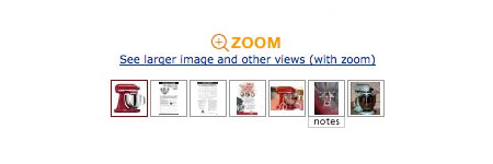
3. Use more than one image for each product
It depends on the product, but most products will gain by being shown from multiple angles. It also shows the customers more about the item and helps to build trust, it doesn’t look like you are trying to hide something from him.
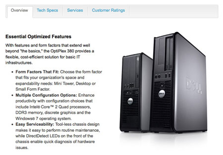
4. Give details about the product
I want answers to all the questions I could ask if we were in a physical store. Don’t let your customers doubt, otherwise they’ll go to another website.
5. Make your Cart page good
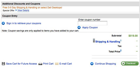
It should be simple for the customer to change the quantity of items, remove anything he wants or go back to the shop. Give him full control, let him estimate taxes and shipping there too.
6. Have a search that works
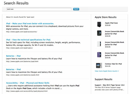
Some users are more search oriented than others (like me!), make sure they will find their way in the search results easily. Include pictures in the search results, some people are more visual than text readers.
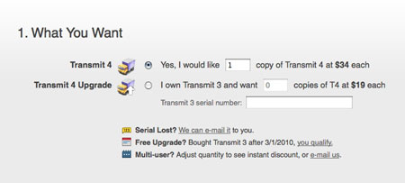
7. No hidden fees!
Ever ordered a product and had to pay taxes that were more expensive than the product itself? I did, and I never ordered anything from that shop again. Don’t deceive your customers.
8. Give a real adress and phone number
On all pages, display a landline phone number and a street address. There should be a way to contact you that’s not electronic, your customers must know that humans are available to help if they’re lost or confused.
9. Don’t confuse the users
Reduce or eliminate anything that could be confusing to your customers, they are only one click away from not purchasing from your store.
10. Have a newsletter
But never spam your customers, and it should be an opt-in newsletter or the users could feel cheated. A newsletter is a powerful tool to keep in touch with your customers (and sell more).
11. Let the customers sort your products
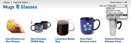
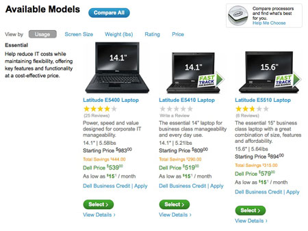
If they have a $30 budget for a design book, they want to filer out the more expensive ones. For computers your customer may want to filter out the offers from a specific vendor or the ones with the best reviews. Let them filter by vendor, brand, review, price,… and it’ll make their life easier.
12. Make your URLs search-engine friendly
Obvious one, but had to say it. Use smart categories or tags names that are included in the URL.
13. Include popular searches URLs in your Google sitemap
I don’t know if every e-commerce software lets you do that, Magento does. This is good for SEO and helps to be found on popular searches.
14. Have a wide range of payment options
Some people don’t have a credit card, other don’t use PayPal or Google Checkout, make sure to allow everyone to pay.
15. Let the users compare products
This doesn’t apply to every website, but most large ecommerce websites will benefit from letting their users compare two or more products.
16. Have a simple shipping form
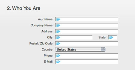
One way to simplify the checkout process is to have a lightweight shipping form. Don’t ask too many details or require things you don’t need (like the phone number), if billing and shipping adresses are the same, let your customers fill the form only once.
17. Offer shipment tracking
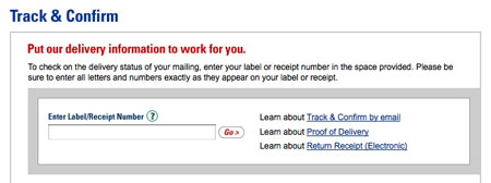
Once they order, your customers want to know when they’ll get their products, give them shipment tracking number (most carriers give you one) and give them an estimate of when they’ll get the products.
18. Give the user some recommendations
Like Amazon does: “Peoples who bought this also bought” and other recommendations, they are a hint to your customers and will probably increase your sales.




2 comments:
I love this post !! The points are to be reg all the day in mind !! Good work….
Lot of useful points are there. Its really keeps me updated.
E-commerce portal development tools
Post a Comment